DiverBubbles · 2020
I designed the products, the store, and the brand. Then I audited the store and stopped redesigning it.
A scuba apparel brand I've owned since 2020. I design the prints, I designed and built the storefront, and I run the Shopify backend. It's also where I learned what design can't fix.
- Role
- Founder — product design, UX/UI, front-end, store operations
- Timeframe
- 2020 – present
- Team
- Solo
- Platform
- Shopify (custom Dawn-based theme), print-on-demand
- E-commerce
- Product design
- Ownership
- Accessibility
- Checkout conversion
- ~63%
- Performance / accessibility
- 91 · 94
- Products designed
- 326
The situation
I started DiverBubbles before I was a designer. I wanted to build something of my own, and doing it meant doing everything: the brand, the prints, the photography direction, the store, the copy, the fulfilment. Somewhere in that I found the part I actually loved — the flows, the interfaces, the decisions about how something should work — and that's why I moved into product design.
The store is still live and still earning, and I still design its prints. It's the only product where I own every decision and see every number.
Designing the products
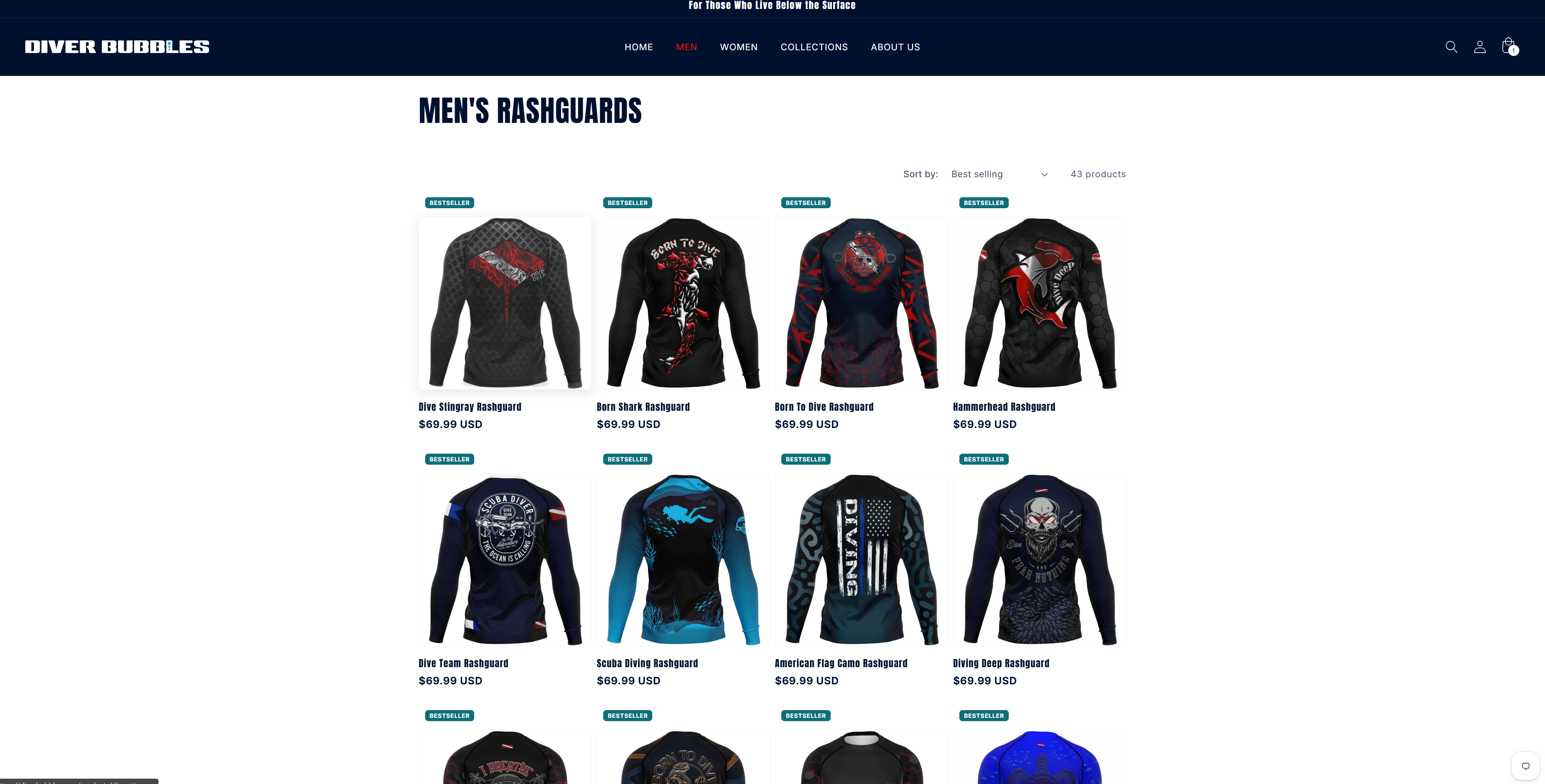
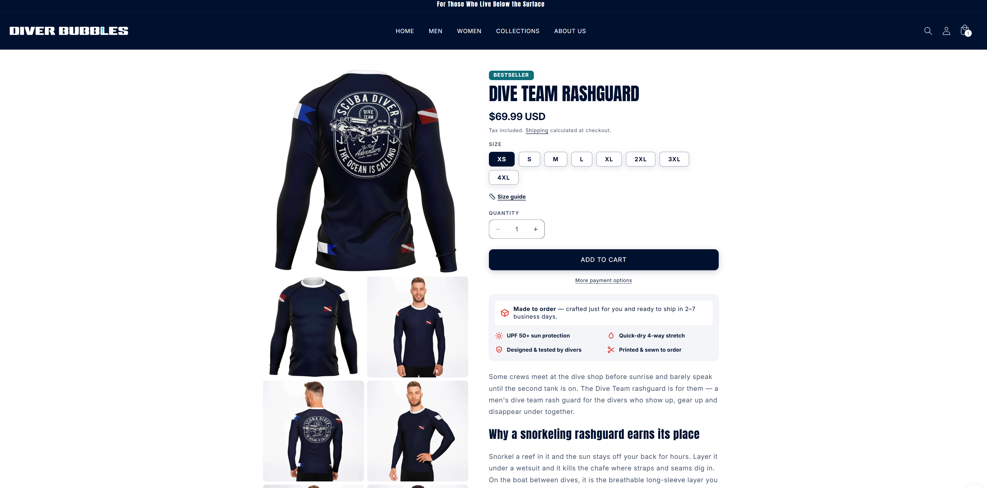
Every print on every garment is mine. All-over-print ocean designs — sharks, rays, octopus, whales, sea turtles — across long-sleeve rashguards, hoodies, polos, and jerseys. 326 products, 255 live.
The ideas come from customers. I watch what sells and what stalls, I run questionnaires, and I talk to buyers directly over email — this is a niche audience, and divers will tell you exactly what they think. A print starts as something a customer said. From there it's Photoshop and AI tooling to get from concept to a production-ready file.
It's the same instinct I use at work, running on a smaller loop: ask the people who use the thing, then design from what they say. The difference is that here I see the sales data the following week.
Print-on-demand makes the execution harder than it sounds. An all-over print has to survive a template that wraps a flat design around a garment with seams, sleeves, and size variation — a design that reads well flat can break at the shoulder. And these are technical garments: UPF 50+ on the certified polos, built-in UV protection on the rashguards. People wear them in the water.
The system around it runs largely on its own — automated order flow, automated email, print-on-demand fulfilment. Nothing is warehoused; every item is produced when it's ordered. That's what makes a 326-product catalogue possible for one person, and it's also why a wrong size chart is expensive: a return on made-to-order stock is a total loss.
Designing and building the storefront
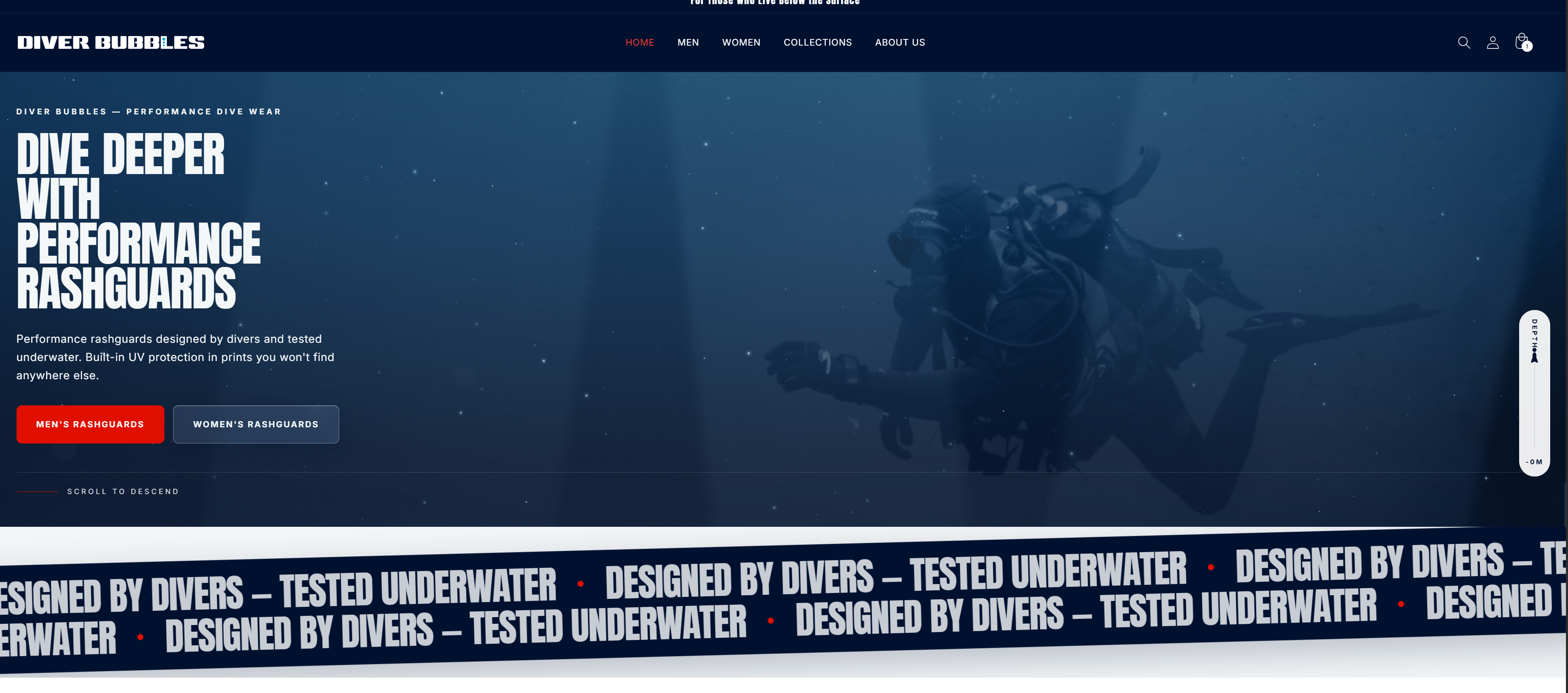
I rebuilt the homepage from scratch on Shopify's Dawn base. Custom sections, no page builder.
Deep-sea hero — a marine-snow particle canvas with cursor repulsion and scroll-reactive motion. Particles drift like suspended sediment in dark water.
The depth meter — a small diver that descends a track as you scroll, trailing bubbles. Scroll depth as literal depth. The most original element on the site, and the one that ties the interface to the brand.
Liquid nav hover — an animated water-displacement filter that warps on hover. This took several passes; a flat overlay was masking the effect entirely before I found it.
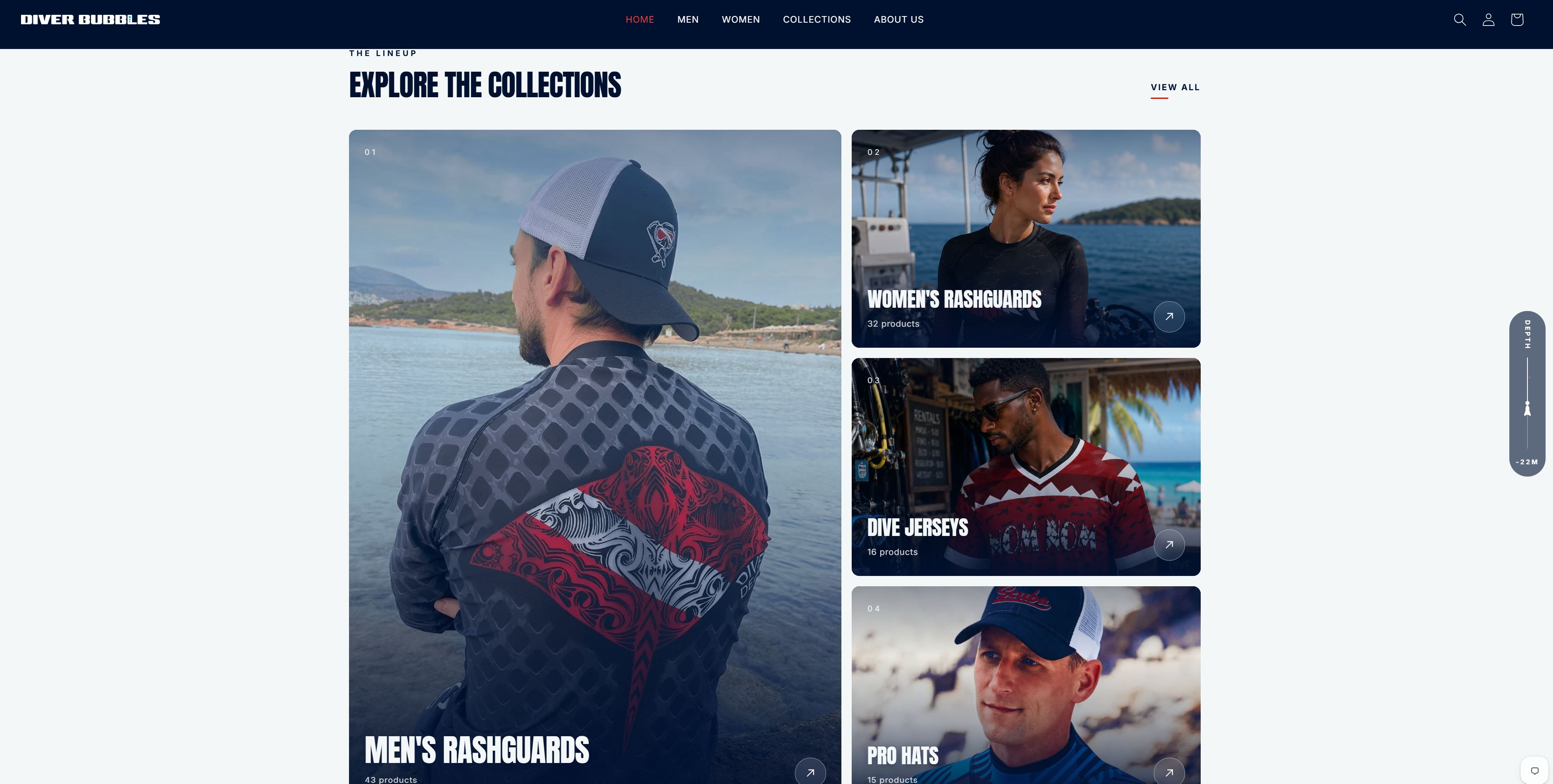
Plus a scroll-pinned product showcase, a hover-crossfade print lab, count-up stats, and a mega-menu with image cards.
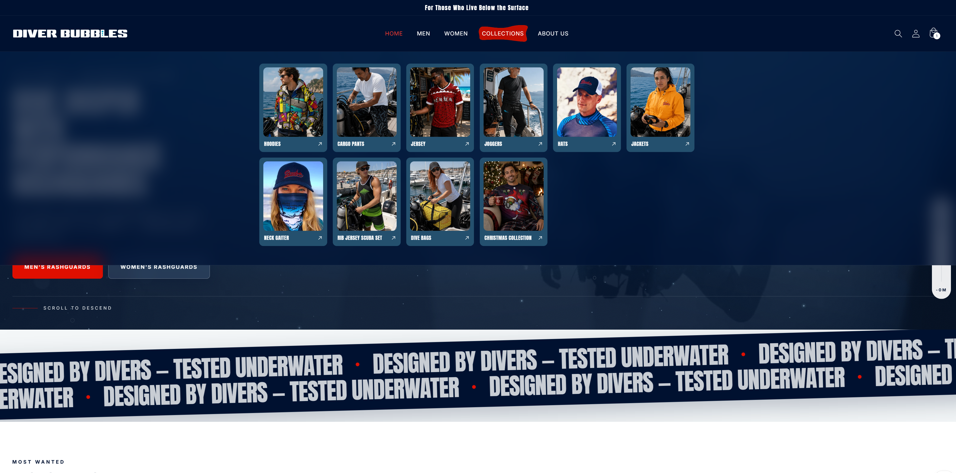
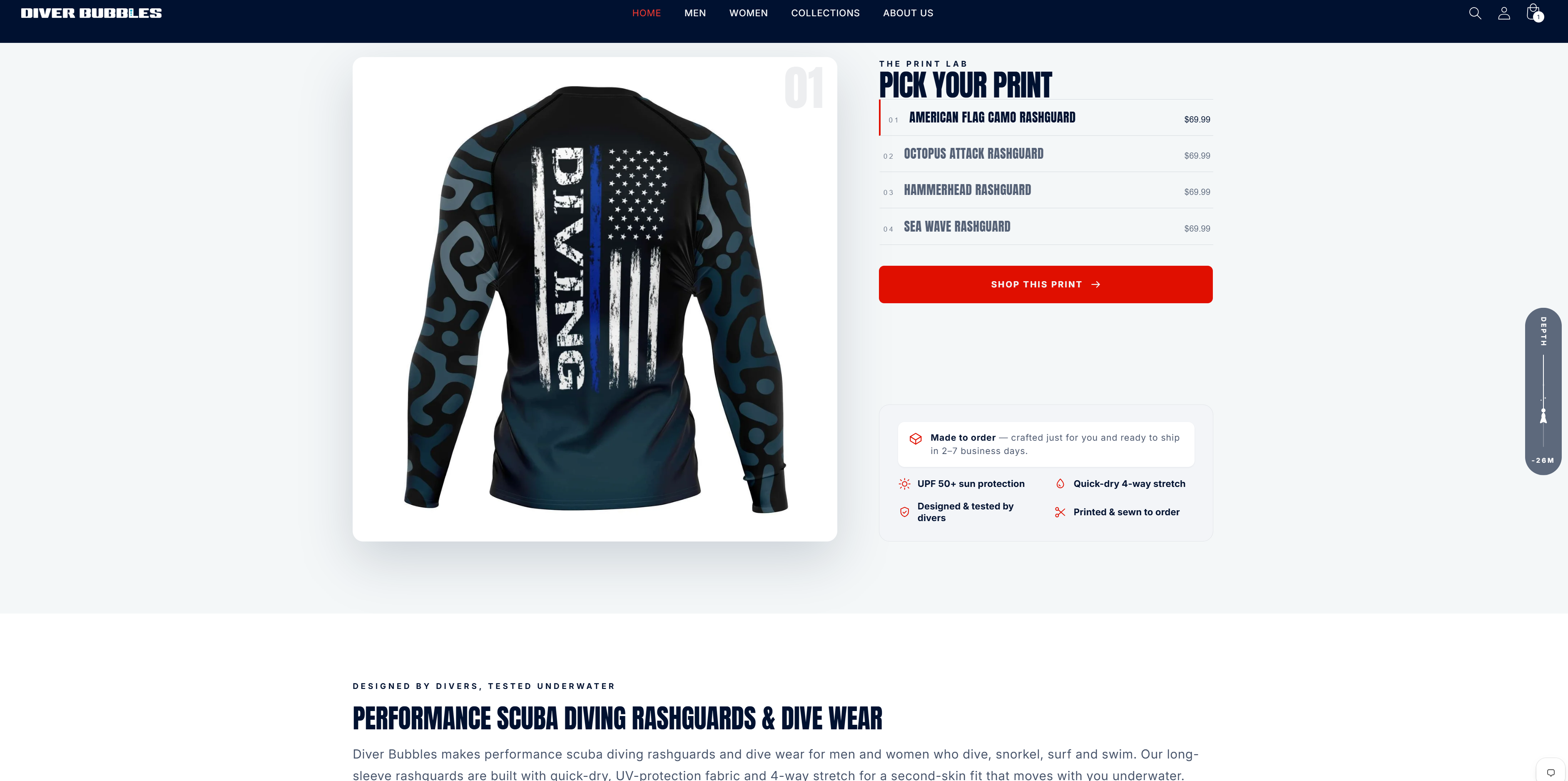
The design system is navy, foam white, and a brand red. The red is worth explaining: I'd originally chosen a brighter one that failed WCAG AA on white text. The current red gets it to roughly 5:1. The brand colour changed because of a contrast ratio.
The invisible work
Some of the most useful work on this store was the least visible.
Size charts. They were images of tables — invisible to search engines, invisible to screen readers, unreadable zoomed on a phone. I rebuilt them as real HTML tables, inch and cm, brand-styled, mobile-scrollable. Converting between units to cross-check surfaced a genuine data error in the source: an XS hoodie sleeve length off by a full inch between the cm and inch versions.
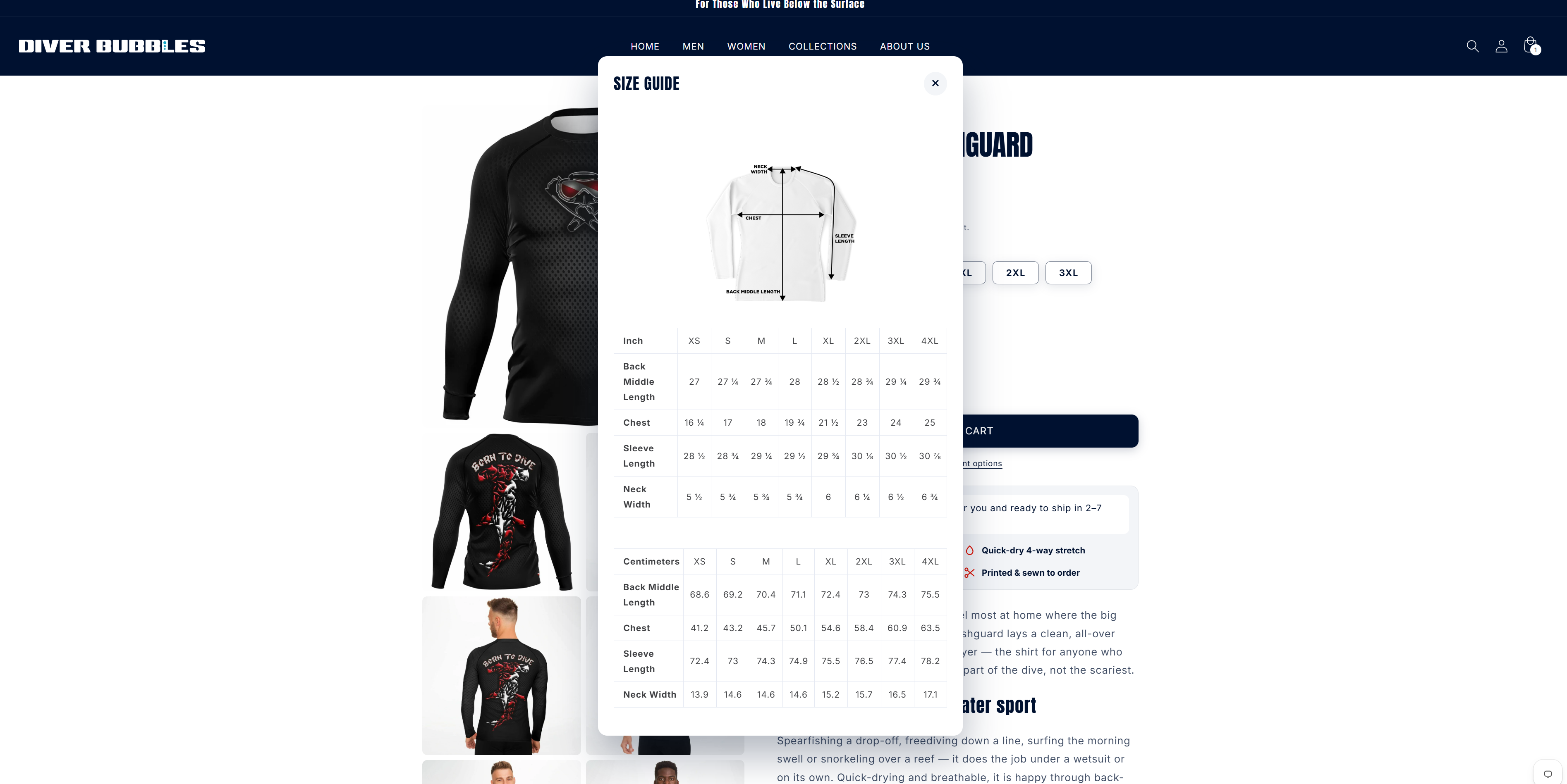
Then the metafields — which chart each product actually pointed at. Two real failures: one men's rashguard linked to the shipping page, so customers opening the size tab got delivery information; and one women's product linked to the men's chart, meaning a woman would size off men's measurements and get the wrong fit. All 83 rashguard products now point at the correct chart.
A false legal claim. The shipping policy told EU customers VAT would be charged by the carrier on delivery. The order records show it being collected at checkout, inclusive — 21% Belgium, 21% Netherlands, 23% Poland, 24% Greece on real orders. Customers were being told they'd pay twice. It appeared on five shipping pages, the homepage FAQ, and inside the structured data Google indexes. EU orders were 6 of the last 25.
Trademarks. Product alt-text contained three third-party dive-certification trademarks across 19 products. Removed.
Performance. The hero image carried loading="lazy" and
fetchpriority="low" — the browser was being told the largest element on the
page didn't matter. Four showcase images weighed 690–732KB each; a CDN format
parameter cut about 1.6MB with no visual change. Result: 91 mobile, 92 desktop,
94 accessibility, 1.6–2.0s load.
Contrast and screen readers. Review text failed WCAG AA on semi-transparent ink — now solid, at 10.2:1. Review carousel links had no accessible name; they're labelled now.
The outcome
Checkout conversion is about 63% — 10 orders against 6 genuine abandoned checkouts over 90 days. Well above typical. People who reach checkout buy.
The store is fast, accessible, correct, and it converts.
Then I audited it, and stopped redesigning
I ran a full adversarial audit of my own store — every dimension checked, then every finding independently re-tested to try to disprove it. Of 42 findings, 40 were refuted. A second audit refuted 29 of 42.
The verdict was that the store was well-built. Complete SEO across all 255 products, correct canonicals, clean sitemap, zero mobile overflow, healthy checkout conversion. Most of what I assumed needed fixing didn't.
What it did find was the actual constraint, and it wasn't design.
Traffic peaked at around 3,644 sessions a month in late 2022, held near 1,000 a month through 2023, and now runs about 3 a day. The cliff is December 2023: 1,175 sessions in November, 417 in December, and it never recovered.
Sessions and orders · Shopify, from the store's first recorded month to Jul 2026
Peak — Nov 2022 · Dec 2023 — stopped posting
- Month
- December 2023
- Sessions
- 417
- Orders
- 7
- Conversion
- 1.68%
Every month as a table
| Month | Sessions | Orders |
|---|---|---|
| October 2022 | 1,667 | 11 |
| November 2022 | 3,644 | 31 |
| December 2022 | 1,752 | 12 |
| January 2023 | 1,073 | 5 |
| February 2023 | 1,485 | 4 |
| March 2023 | 1,288 | 0 |
| April 2023 | 762 | 4 |
| May 2023 | 1,025 | 2 |
| June 2023 | 686 | 9 |
| July 2023 | 1,308 | 5 |
| August 2023 | 903 | 4 |
| September 2023 | 1,069 | 6 |
| October 2023 | 1,274 | 6 |
| November 2023 | 1,175 | 17 |
| December 2023 | 417 | 7 |
| January 2024 | 343 | 1 |
| February 2024 | 304 | 3 |
| March 2024 | 333 | 4 |
| April 2024 | 333 | 7 |
| May 2024 | 135 | 6 |
| June 2024 | 158 | 4 |
| July 2024 | 167 | 5 |
| August 2024 | 159 | 2 |
| September 2024 | 169 | 6 |
| October 2024 | 202 | 6 |
| November 2024 | 339 | 16 |
| December 2024 | 179 | 7 |
| January 2025 | 119 | 2 |
| February 2025 | 113 | 1 |
| March 2025 | 99 | 1 |
| April 2025 | 112 | 0 |
| May 2025 | 108 | 3 |
| June 2025 | 150 | 7 |
| July 2025 | 139 | 1 |
| August 2025 | 105 | 5 |
| September 2025 | 339 | 1 |
| October 2025 · bot | 2,583 | 5 |
| November 2025 | 174 | 7 |
| December 2025 | 124 | 4 |
| January 2026 | 93 | 7 |
| February 2026 · bot | 2,742 | 4 |
| March 2026 | 81 | 5 |
| April 2026 | 68 | 0 |
| May 2026 · bot | 2,722 | 2 |
| June 2026 | 89 | 3 |
| July 2026 | 110 | 5 |
The cause is me. I took another job in 2023, and by the end of the year I had stopped posting. Social went from 258 sessions a month to 1. Direct went from 617 to 40 — and most of that direct traffic was social too, since in-app browsers strip the referrer. Search barely moved, because search was never the engine: about 13% of traffic at peak. Instagram posts and Facebook ads were carrying roughly 87% of demand, and one person was doing them.
Search Console makes the ceiling explicit: 42,500 impressions, 163 clicks, average position 9.7. The store ranks for the right commercial queries and can't break past position ten — because it has 6 external backlinks.
So I made two calls.
I didn't do on-site SEO. The on-page work is already correct; the constraint is off-site authority. Optimising pages that are already optimised wouldn't move position 9.7.
And I stopped optimising conversion. At 3 sessions a day, no on-site change is measurable. I could have shipped variants and reported wins, and none of it would have meant anything. I built the recovery infrastructure — a content system, email automations, customer segments — and left the site alone.
What isn't proven: traffic hasn't recovered. That depends on me restarting the channel, and the store redesign is paused.
Reflection
I built a beautiful store and then found out it was never the bottleneck.
The useful skill wasn't the particle canvas or the depth meter — those are craft, and I'm glad they're there. It was being willing to audit my own work adversarially and accept a verdict that made most of it beside the point.
It's the same instinct I brought to the quality label at eduki: before fixing the obvious thing, establish what's actually broken. On someone else's product that's good practice. On your own it's harder, because you're the one who built it — and in this case, because the answer was that the problem was me.