1555.gov.gr · 2023
The institutional structure had to stay. So I moved the fix somewhere else.
1555.gov.gr is the Greek Ministry of Labour's digital front door to employment, insurance, and social support. I led its redesign from a basic site people couldn't complete tasks on — and when the department-based structure turned out to be non-negotiable, I solved the usability problem at the form layer.
- Role
- Product Designer — led UX
- Timeframe
- 2023
- Team
- Choose Strategic Communications Partner, for the Ministry of Labour and Social Affairs
- Platform
- Public web service, Greek
- Public sector
- Information architecture
- Accessibility
- Respondents with a complaint, before → after
- ≈50% → ≈10%
- Survey respondents, per wave
- 200
The situation
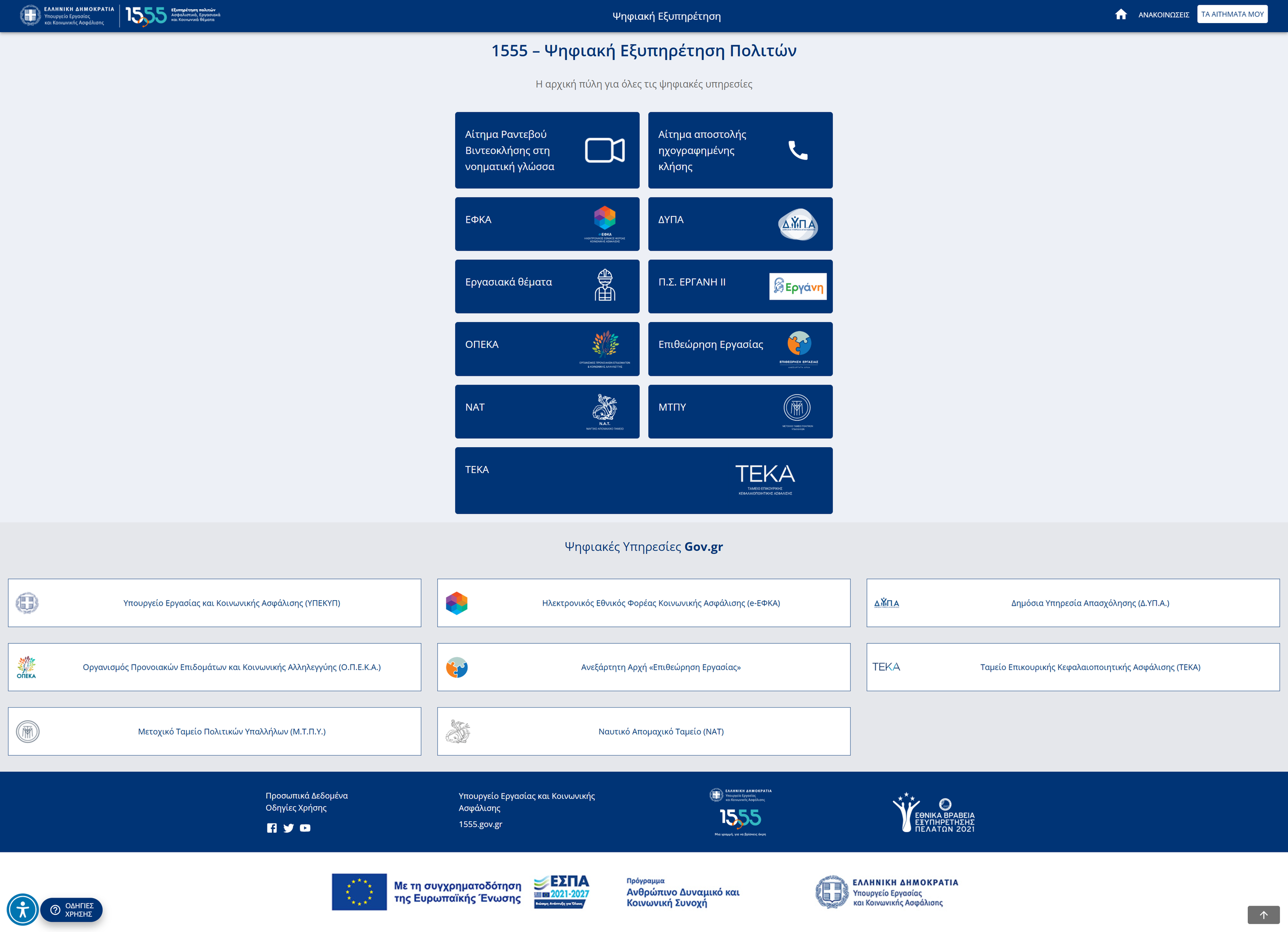
1555 is where Greek citizens go when they need something from the state: an unemployment benefit, a pension query, an insurance record, a labour complaint. It aggregates a dozen separate public bodies — ΕΦΚΑ, ΔΥΠΑ, ΟΠΕΚΑ, ΝΑΤ, ΜΤΠΥ, ΤΕΚΑ, the Labour Inspectorate — behind one entry point.
The audience is everyone. Wide, demographically mixed, with low average digital literacy, and often approaching the site at a stressful moment — you don't apply for unemployment support casually. Most of them have no alternative route except the phone line the platform exists to relieve.
The site they arrived at was very basic. People struggled to book appointments with the services behind it, and many gave up and called instead.
The constraint
Here's the part that shaped everything: the structure was not mine to change.
1555 is organised by public body, because Greek public administration is organised by public body. ΕΦΚΑ, ΔΥΠΑ, and ΟΠΕΚΑ are separate institutions with separate mandates, separate systems, and separate ownership of their own content. That taxonomy isn't a design decision anyone made — it's the shape of the state.
But it doesn't match how people arrive. Nobody wakes up needing "ΔΥΠΑ". They wake up unemployed. The user's mental model is a life situation; the platform's model is an org chart, and the citizen is asked to translate between them before anything can happen.
I proposed a user-centred structure grouped by life situation. The institutional structure had to stay.
The decision
I regrouped where I could, and moved the fix where I couldn't.
Selectively, inside certain branches, I grouped services around what people were actually trying to do. That worked in some places and not others — where a body owned its own content and labelling, the department framing stayed. It's a partial win.
Then the more useful move. If citizens had to navigate an institutional taxonomy, the cost of doing so should at least be paid once.
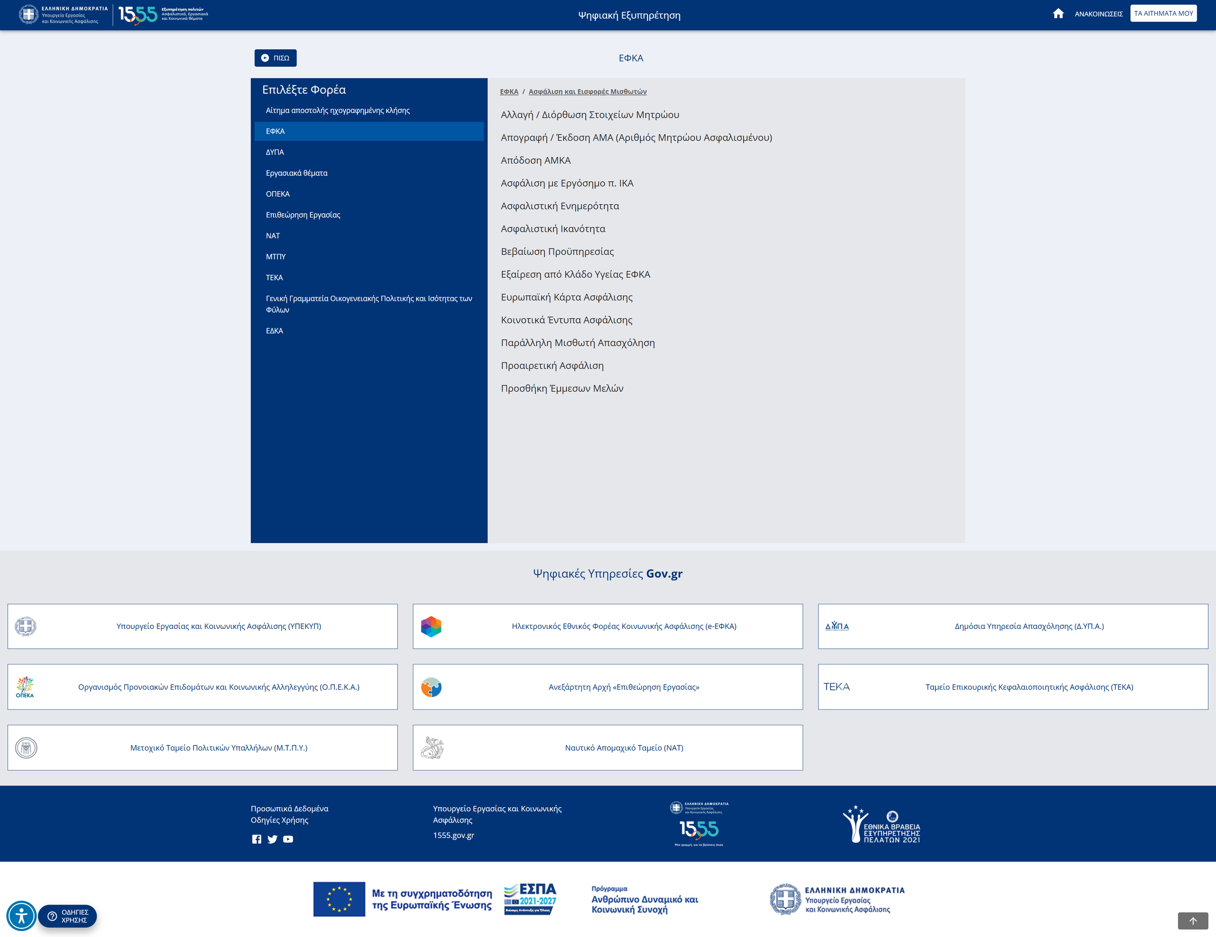
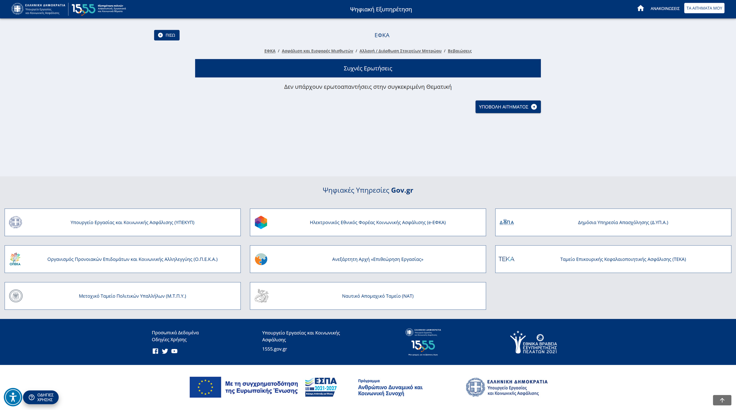
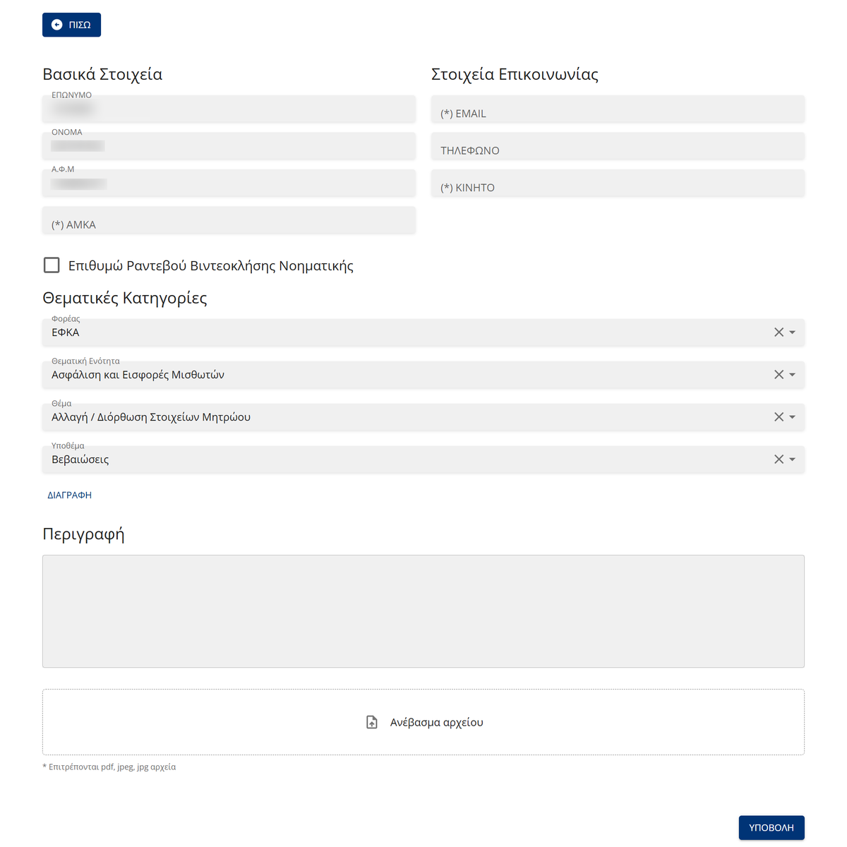
The old flow made them pay repeatedly. Reaching a request meant working down four levels — agency, then thematic unit, then topic, then subtopic — and the funnel is genuinely deep: ΔΥΠΑ alone opens onto about fifteen thematic units, one of which opens onto seventeen topics, one of which opens onto eight subtopics. Worse, that path could dead-end. A user could descend all four levels to a FAQ page and find "Δεν υπάρχουν ερωτοαπαντήσεις στην συγκεκριμένη Θεματική" — no answers here — and still have to submit a request anyway.
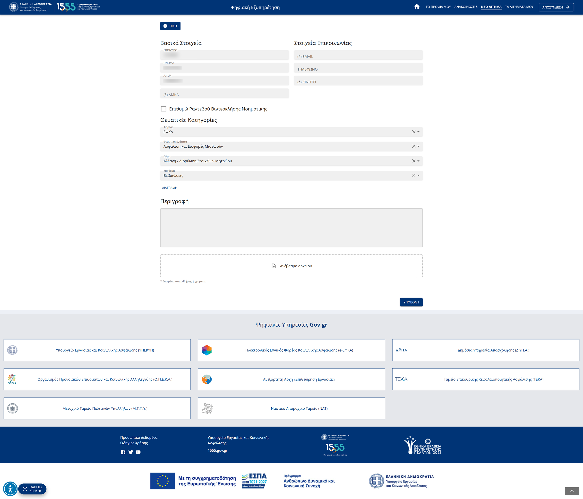
So I carried the navigation state into the form. By the time someone reaches the request screen, the four taxonomy choices they already made are pre-filled — Φορέας, Θεματική Ενότητα, Θέμα, Υποθέμα — and editable if they got something wrong. Navigation and submission stopped being two separate acts of classification and became one. What was left for the user was their own name, contact details, and their actual problem.
Alongside that I cut steps out of the forms, deferred fields to later stages where they weren't needed up front, and reworked the request flow so people could complete a booking without calling.
What it cost. Selective regrouping means the experience isn't uniform — some branches read by life situation, others by institution, and consistency suffered for usability in the places I could reach. Some ministry-facing labels disappeared, which is a real loss for the internal audience who recognised them. And carrying navigation state into the form means a user who took a wrong turn early carries that error forward — mitigated by making every pre-filled field editable, but not eliminated.
One thing worth naming: the two most prominent options on the entry screen are a sign-language video-call appointment and a recorded-call request — accessibility routes given first-class placement at the top of the grid.
The outcome
I ran user surveys before and after the redesign, with 200 respondents in each — one wave before launch, one a few months after. The share of respondents with a complaint fell from roughly 50% to about 10%.
Navigation got clearer and request submission got shorter, but the complaint figure is the number I actually measured, so it's the one I'll stand behind.
Reflection
The instinct was to fix the information architecture, because that's where the problem was. The IA wasn't available to fix — it belongs to the structure of the public sector.
What I'd carry forward: when the root cause is out of scope, the question is where else can the cost be absorbed? Here it was the form layer. The citizen still meets an institutional taxonomy — they just don't have to describe it twice.
And in public services the stakes of that are different from commercial work. A confusing checkout costs a sale. A confusing benefits form costs someone a benefit.
The work
Four screens from the live redesign. There is no before-state: the old site is gone and isn't accessible, so the earlier experience is described above.